Olympic Designs
I was researching about Otl Aicher who was the lead designer for the 1972 Munich Olympics. It turns out he was one of the designer whose pictograms inspired the DOT pictograms which then went on to inspire the ubiquitous signage pictograms that we see everyday I could find atleast one reference which definitively says that DOT pictograms were used during the standardization process of ISO 7001 in the book “The Politics of Design” by Ruben Pater, in the Chapter Symbols and Icons, subsection Icons of Inequality . I used to think that emoji’s and related pictograms were actually introduced during the Japanese Olympic, but from what I could figure out from my limited research, the genealogy of emoji’s is much more diverse. Nonetheless, Otl Aicher did seem to have consulted with the designer of the 1964 Japanese Olympic Games. As such there is a direct line of inspiration from the Japanese Olympics to the current signage.
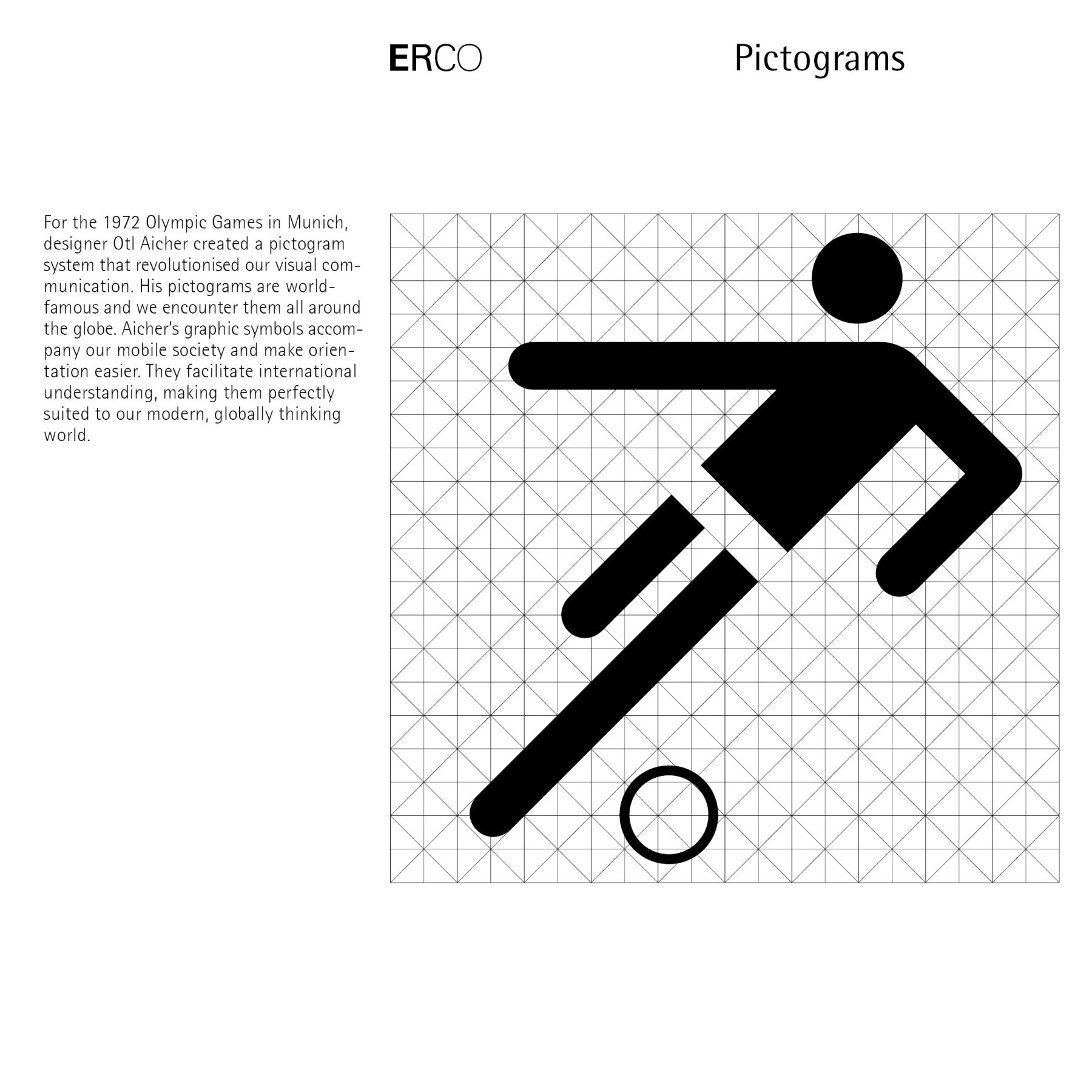
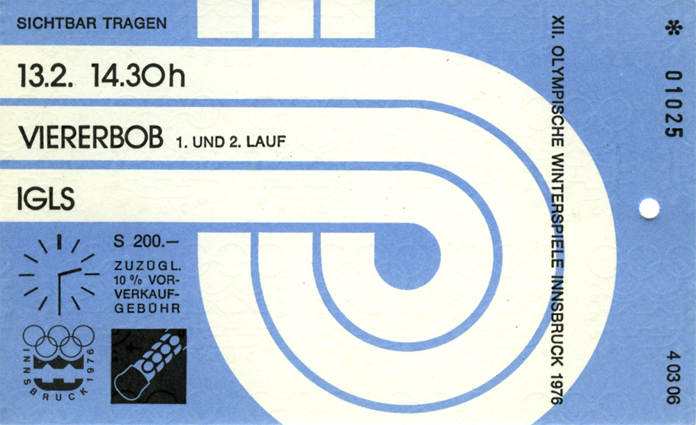
While doing this research I stumbled onto this excellent website which documents the various design elements of Olympic Games.
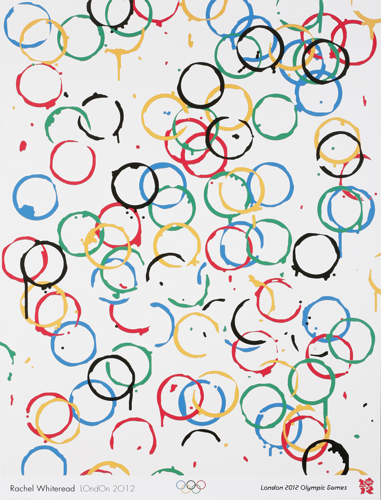
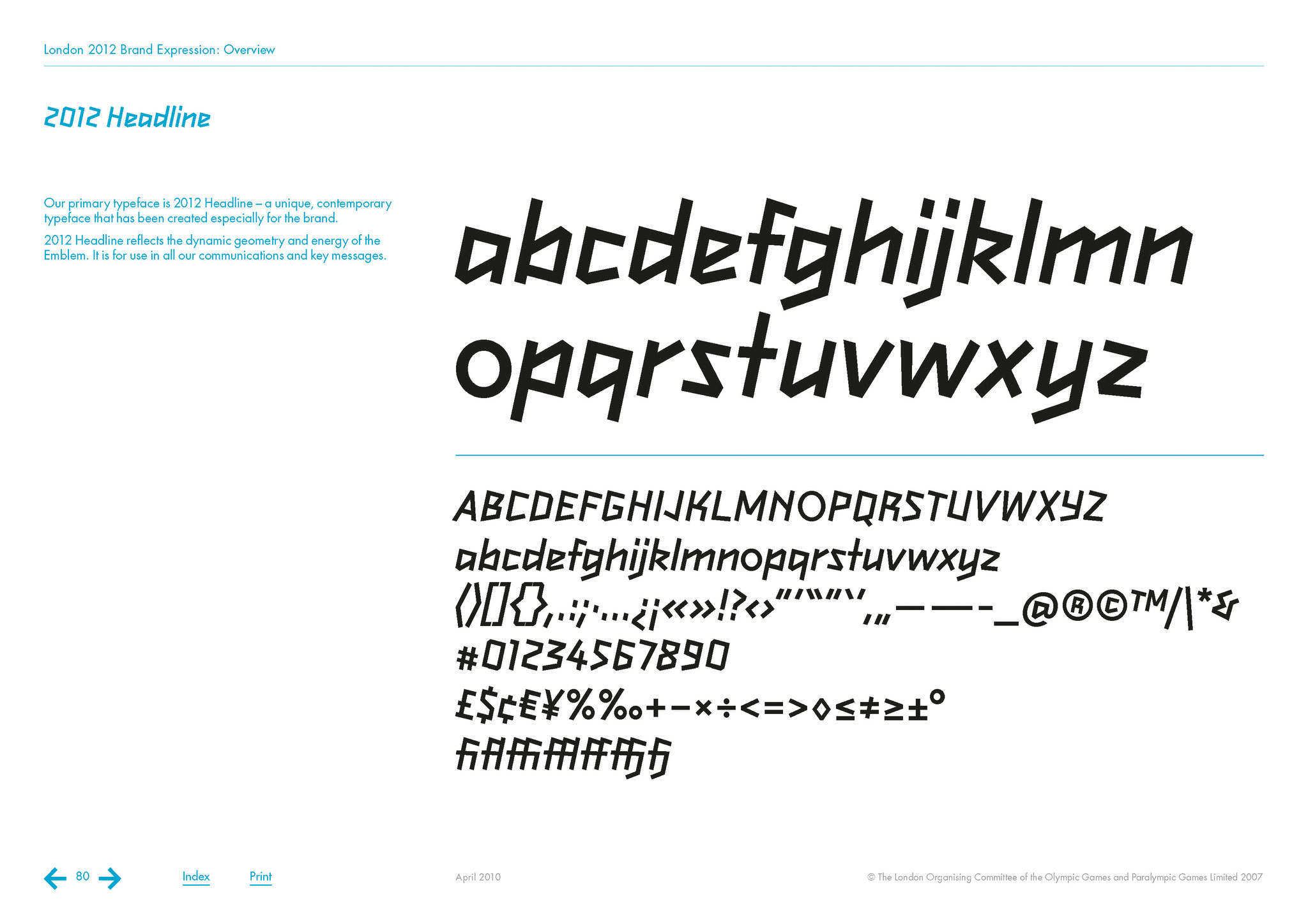
I particularly like a lot of visual elements from the 2012 London Olympics, except probably it’s mascot Wenlock. From the looks of it, it’s probably the only Olympic mascot with one eye, which is not even an eye but is supposed to be a camera according to it’s description.